Oct 26
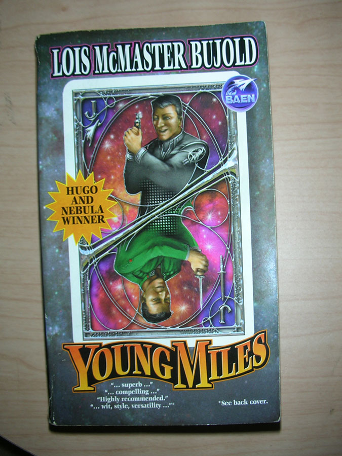
Durbin Comments: Book officials were shocked when it was revealed that an elderly parishioner had painted over a deteriorating fresco with a haphazard splattering of paint. “The once-dignified portrait now resembles a crayon sketch of a very hairy monkey in an ill-fitting tunic,” one official says.
Published 2010 (maybe)
You might remember this from here


 Click for full image


 Lastest Tweet
October 26th, 2012 at 10:04 am
Sean Bean’s pretty desperate for work, huh?
October 26th, 2012 at 12:47 pm
I vastly prefer the eco-friendly edition, Green Miles.
October 26th, 2012 at 1:22 pm
OK, now I want to know what’s the on the back cover!
October 26th, 2012 at 2:53 pm
Yes, back cover image please. This isn’t the first Baen-Bujold to have this tantalising footnote.
If only the upside-down chap had held his dagger closer to his head, he could have got himself a free TING! by merging dagger with background star.
October 26th, 2012 at 4:54 pm
TWO hands to hold that little dagger? Really? TWO?
October 26th, 2012 at 5:55 pm
Another case of “Horrible cover, but great book!” It’s a repackaging of 2 novels and a short story. The short story and the 2nd novel both won major SF awards.
Get the ebook, you won’t have to worry about looking at the cover 🙂
http://www.baenebooks.com/p-481-young-miles.aspx
October 27th, 2012 at 12:51 am
The “HUGO AND NEBULA WINNER!” splash is boilerplate Baen, but Baen also has in store some last-case splashes for hopeless cases and also-rans:
– “The author is WINNER OF THE MINNESOTA STATE LOTTERY!”
– “WINNER OF HEARTS AND MINDS!”
– “WINNER OF THE EDITOR’S SPECIAL AWARD FOR FIRST RELEASES”
– “WINNER OF FUTURE AWARDS”
October 28th, 2012 at 3:41 am
I see someone’s been screwing around with the fashion department’s mannequins again. Artsier than just witching all their heads around again i guess.
October 30th, 2012 at 8:19 pm
And here’s the full paragraph from which the editor cut out those suspiciously brief “review quotes”:
“If baby poop were delicious, this book release would make a superb (1) meal. Instead it makes compelling (2) evidence that Baen Books has lost all standards of quality and all respect for its readers. I can’t remember the last time someone greeted a Baen release with the words ‘Highly recommended (3) — and it probably won’t happen ever again. Expect no wit, style, versatility (4) or basic editing competence from this wretched publication, because those things are apparently no longer in any high regard at Baen. Avoid!”
November 3rd, 2012 at 5:46 pm
“. .. wit, style, versatility. . . .” –Locus
“. . . all the ‘right stuff.'” — Science Fiction Review
“. . . extraordinary . . . deserving of the highest
recommendation.” –Booklist
“. . . superb . . . one of the great voices of speculative
fuction.” –Rave Reviews
That’s what’s on the back cover, funny spacing in ellipses and all. Second printing, 2005. Cover art by Larry Dixon.
November 3rd, 2012 at 10:26 pm
Coming soon from Baen:
BEST OF THE REVIEW QUOTES
Re-live the golden oldies of our past book covers! Featuring evergreens like “…highly recommended…”, “…superb”, and “…extraordinary”!
The critics rave about BEST OF THE REVIEW QUOTES:
“. .. wit, style, versatility. . . .â€
“. . . all the ‘right stuff.’â€
“. . . extraordinary . . . deserving of the highest
recommendation.â€
“. . . superb . . . one of the great voices of speculative
fuction.â€
November 12th, 2012 at 4:34 pm
I just got a copy of Captain Vorpatril’s Alliance, and the cover was fairly bland. At least, until I looked at the back… and there was a picture of the three main characters, technically correct but indifferently rendered. I will be sending that one in soon—it’s the first time I’ve seen the back of a cover used as a principle concept, instead of the front.
January 4th, 2024 at 4:50 pm
This BAEN re-issue cover is so overwhelmingly heady it make me dizzy from all the headiness.
https://www.amazon.com/Young-Miles-Lois-McMaster-Bujold/dp/0671877828
January 5th, 2024 at 3:34 am
@fred: I was thinking, before I clicked, “is that the one where you can see up Miles’ nose?” Indeed.
The good thing is, if you just want to read the content, you can now get books with more abstract covers, which are published in ebook by Lois’ publishing agency, so you won’t be looked down upon even if someone sees the whole thing in full color on your screen. Nor will you be supporting insurrectionist fascists, just a very nice older Midwestern lady who the fascists don’t deserve.