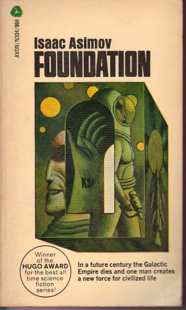
Dec 19
Jami Comments: Actually the best part is inside when I was trying to find dates on this. It’s the dedication Asimov wrote.
“To My Mother
Of Whose Authentic Gray Hairs
Not a Few Were Caused by Myself”
Yes, that’s how it’s capitalized inside.
Published 1970


 Click for full image

 (9.27 out of 10)
December 19th, 2012 at 9:19 am
I like how the space suit comes complete with man-boob holders.
December 19th, 2012 at 11:03 am
The Isaac Asimov College Prospectus: for Foundation Courses, naturally.
December 19th, 2012 at 11:58 am
Not just an Evil Space Glove. An Evil *Six-Fingered* Space Glove.
December 19th, 2012 at 2:01 pm
My favorite part is how amused Mr. Giant Head on the left seems to be.
December 19th, 2012 at 5:35 pm
“I like how the space suit comes complete with man-boob holders.”
Well obviously psychohistory predicted a greater need for man-boob accommodation. That may have been left out of the books, but it’s been quite some time since I read them.
December 19th, 2012 at 6:19 pm
I prefer Foundation and Empire with the Mule on the cover.
http://www.flickr.com/photos/retrosapien/1365623999/
December 19th, 2012 at 7:33 pm
‘I am Hari Seldon!…and I find this absofuckinglutely embarrassing!’
It took me a second glance to realize that it’s supposed to be a cube, with a little tunnel cut through it, and the space glove’s fingers are arching over the ceiling. I can’t remember anything like that in the original.
December 20th, 2012 at 12:55 pm
Oh yeah man, my favorite part of Foundation was where the alien spaceman and the evil Easter Island heads got trapped in a cube with that tattooed claw.
Anyway, I think that’s what happened. My copy was printed in Dutch.
December 20th, 2012 at 5:15 pm
The initials KSP were supposed to be a bit more secret – that’s what the S stood for.
December 22nd, 2012 at 5:22 am
Goddamn, but we get ugly in the future.
January 5th, 2013 at 10:35 pm
This was the cover that graced the copy I read (I even recently found a picture of me reading it). I didn’t have too many qualms about reading it in public, after all it said “Asimov” on it, right. That makes it look smart even if the cover art doesn’t, right? Right?
Once upon a time, I used to receive a Science Fiction book club newsletter from the now defunct Waldenbooks called “Xignals”. They ran a big story about how there was going to be a new reissue of the original Foundation Trilogy with New Cover Art by Michael Whelan. I was just at the right age that I was like, “Michael Whelan! Wow! How Awesome is That! Those are the copies I want to read!” Then I went to the bookstore and found the first one:
http://www.paperbackfantasies.jjelmquist.com/images/whelan/AsimovFoundation.JPG
What an incredibly high creep factor. Oh, and nothing says “High-Concept Science Fiction” like a fossilized Hari Seldon in a Wheelchair. I went back home and borrowed my dad’s copy, with it’s slightly more charming artwork.
Although in retrospect, once you read Foundation, you can’t help but think Whelan was making some sort of commentary about the story….
May 3rd, 2013 at 9:04 pm
It looks like this Good Show actually made it into orbit:
http://www.flickr.com/photos/37996580417@N01/2986170166
I think it’s interesting that Dr. Voss also opted for the original cover, not the Whelanized version.
But that’s kind of cool. A cover here actually went into space….Good Show Sir Indeed!
October 11th, 2021 at 10:56 pm
Nothing says space opera like the color green.
October 12th, 2021 at 2:01 am
It looks like an ornately decorated box with transparent panels, so you can see the magic glove (Or an actual tattooed hand? It has nails. Does that say KSF or KSP?) inside. Unboxing videos of the 217th century?
Callback to 2012 @fred: Foundation and Empire might be improved by an actual psychic quadruped (possibly from a land of magic ponies? )
Callback tp 2012 @Stevie T: Harry looks in even worse shape on the Daryl Sweet cover.
https://i.pinimg.com/originals/90/e2/18/90e218bd69b5af80db8e4ab706ca6837.jpg
October 12th, 2021 at 4:25 pm
Out-evolved by having an opposable thumb on both sides.
October 12th, 2021 at 5:42 pm
Take care of your skin!
ISAAC ASIMOV Foundation
preserves your pale, sallow complexion.
October 12th, 2021 at 10:13 pm
This must be from that chapter when Hober Mallow went through the Sea of Holes to fight the Blue Meanies.
October 13th, 2021 at 5:20 am
@ARY: That explains the weird graphics. It’s in some pointlessly fancy box with “art” on it, and it’s weird like perfume ads are.
@Bruce: People in wheelchairs shouldn’t park at the top of staircases. One push and nobody knows psychohistory. Either that, or he has a sad that in the 217th century, the advanced technology known as “ramps” has been forgotten.
@Tat: the Green Meanies?
October 13th, 2021 at 10:06 am
It was brilliant when Mr Benn went into space.
October 14th, 2021 at 12:23 am
If God played dice with the universe, this is what he’d use.
October 14th, 2021 at 3:34 am
@fred: nah, God’s more of a 20-sided dice guy, except for damage rolls.
October 14th, 2021 at 5:17 pm
“Does this spacesuit make me look fat?”
October 15th, 2021 at 2:11 am
@Bruce: Can God make a die with infinite sides, and then lift and roll it?
I’ve never seen anything bigger than a 100-sided one, but surely God could have as many sides as He wants on dice.
October 15th, 2021 at 4:01 am
@GSS ex-noob: here’s a truncated version of the possible ramifications. https://www.youtube.com/watch?v=KYvSRolBXu0&t=232s
October 16th, 2021 at 12:34 am
@Tat: we’re gonna need a bigger stats table.