Oct 21
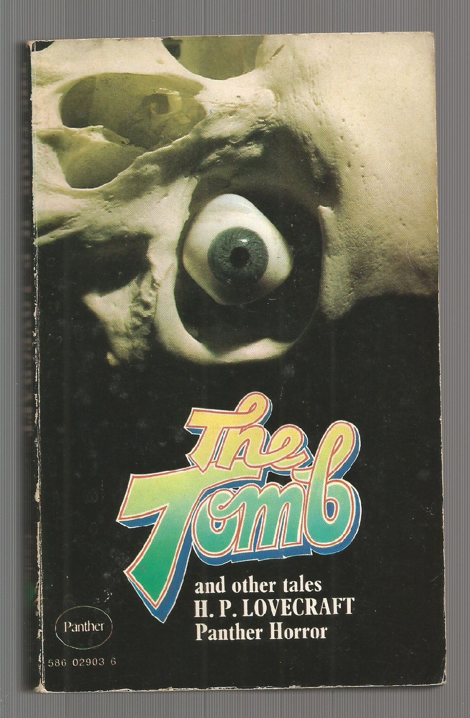
Verylatetotheparty Comments: I can’t believe anybody would choose that font. If the only brief was a piece of paper with ‘title: The Tomb’ written on it, nobody would choose that font. Even the skull on the cover looks like it can’t believe that font.
Published 1970


 Click for larger image

 (9.27 out of 10)
October 21st, 2019 at 10:31 am
Hey, it was the seventies. Even pristine skeletons with weirdly preserved eyes* were feeling the urge to get down and get funky.
*At least that solves the problem of where to inject the drugs.
October 21st, 2019 at 11:02 am
The cover was also used for the James Brown’s 1974 album THE TOMB, featuring the lesser-known Lovecraft-inspired track “Get Up Offa That Unspeakable Floor And Get Down On Your Unholy Feet.”
October 21st, 2019 at 2:31 pm
Do the funky shoggoth. It’s worth looking up H.P. Joelcraft on YouTube. Lovecraft poetry set to Billy Joel’s Pianoman.
October 21st, 2019 at 3:53 pm
For once, the cover’s less dated or embarrassing than the content.
October 21st, 2019 at 3:57 pm
Anyone fancy a marshmallow?
October 21st, 2019 at 4:43 pm
Not the Tomb That Came to Sarnath, surely? (Sorry, somebody had to do it.). And that is a freakin’ awful cover.
October 21st, 2019 at 5:13 pm
I’ll keep an eye out for this title.
October 21st, 2019 at 5:22 pm
How much more work would it have been to connect the ‘e’ in ‘the’ to the ‘b’ in ‘tomb’? You missed a Good Show Sir opportunity, graphic designer person.
October 21st, 2019 at 5:23 pm
I have got to say, nothing gets me in the Lovecraft mood more than googly-eyed skeletons and disco letters.
October 21st, 2019 at 6:22 pm
Cthulhu called, should have texted.
October 21st, 2019 at 7:13 pm
When they voted on this cover in the editorial meeting, did someone actually have to say “Ok, we’re done. The ayes have it.”
October 21st, 2019 at 8:02 pm
It needs a Jeff Beck theme tune https://www.youtube.com/watch?v=27jnSL8GIcs
October 21st, 2019 at 8:37 pm
@B. Chiclitz – [rimshot]
October 21st, 2019 at 10:13 pm
Was I correct to use the term ‘font’ for writing that’s all joiny-uppy and squiggly? It’s bothering me now.
October 21st, 2019 at 10:27 pm
The true eldrich* horror was lurking in Panther’s art department.
@Vlttp: GSS! Your comment was completely on point and the last bit made me LOL. I’d call it a font as well. Or a typeface, but the tags say “font problems”.
@L_L: GSS to you too. It was a necessary callback.
Heck, GSS to all. Quality comments, especially for a Monday. Come for the ludicrous covers, stay for the commentariat.
*Nobody else had used the obligatory.
October 21st, 2019 at 10:56 pm
Knowing me, knowing Cthulhu
A-ha-ah
There is nothing we can do
Knowing me, knowing Cthulhu
A-ha-ah
Maybe this time we’re through
The gates of the Silver key
October 22nd, 2019 at 1:00 am
Plus, the eye is clearly a glass eye, not spherical like a real non-decayed eyeball should be! Lazy craftmanship all around.
The title reminds me of this one from glam band The Tubes: http://www.cobaltjade.com/wp-content/uploads/2019/10/Tubes-Logo.jpg
October 22nd, 2019 at 1:27 am
Meth Bot
shade-tolerant
H.P.CLOVEFART
Hah, Terror Porn
October 22nd, 2019 at 2:11 am
Font colors by the Color From Space, peeping skeleton by Evil Dead.
October 22nd, 2019 at 4:18 am
Gutsy move Tony Marshall. Next time blame it on the Unknown Artist Institute.
October 22nd, 2019 at 11:07 am
@Tracy: That’s what happens when you watch too much television with your head at a 45 degree angle.
October 23rd, 2019 at 7:52 pm
The “e” looks like it’s slapping hands with the “b”.
October 24th, 2019 at 9:09 am
@anon: Could also be P.C H.LOVEFART
@Bruce: GSS.
@A-S: a very 1970 thing to do.