Aug 04
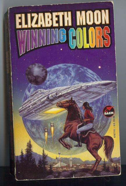
Deborah Comments: Actually I think this is quite good, apart from the woman being none of the central characters – Heris is black, Lady Cecilia’s a redhead, Bubbles is blonde. But the COLORS are a little unsubtle!
Published 1995
Click here for the previous Winning Colours cover.
Many thanks to Deborah!


 Click for full image


August 4th, 2010 at 10:01 am
Far better than the original submission. Like, galaxies better. The horse could do with being a robot horse or something though.
August 4th, 2010 at 10:14 am
The previous cover had a nice SAAB feel to it – even though the execution was crap. This one.. I don’t know. Which one is more accurate wrt the contents?
What’s with all the low-tech stuff in scifi nowadays?
I mean, in many books, the only thing that is “scifi” is the obligatory space ship or that it all happens on some other planet.
August 4th, 2010 at 10:37 am
This cover has epic proportions. Is that planet hovering just above the city?
You know what could have improved this though?
A unicorn.
August 4th, 2010 at 12:45 pm
SI> True, that would do just the job. But its still doesn’t tells us how a game of polo will save the day.
August 4th, 2010 at 12:48 pm
“Quick! We’ll have to ride faster to catch up with that space ship. Think you can jump up into that hanger bay?”
August 4th, 2010 at 9:35 pm
SI: a unicorn? Maybe. Better still: a pegasus! That way she could fly amongst those…strange flying pod things…on their way to the unfeasibly low-orbiting mothership.
August 6th, 2010 at 12:08 am
Agree that a pegasus would be awesome, but this needs a rainbow or better yet a double rainbow in the background.
August 6th, 2010 at 8:48 am
Jose> Double rainbow omg! But, what does it mean?
August 12th, 2010 at 9:14 am
SI – yah, okay, the planet hovering in view is rawther disproportionately large, but I guess the artist was told to make it clear it’s not just a moon, it’s another habitable planet, i.e. we’re not in our solar system.
anon – it’s not all low tech – this book includes bioengineering, cloning & the rights of clones, rejuvenation/anti-ageing processes & consequent social changes, standard SF communications technology, smart desks, diagnosis & treatment via medi-beds, cool things like sonic showers (gets you clean, saves you time!), some good space-opera battle scenes, on-ship environmental systems and super-advanced scan technology (not that the latter is explained in detail, but it sounds convincing in this context).
SophaLoaf and Parker – the horses aren’t pivotal to the plot in this book, but they are in other books in this series, e.g. when the bad guys are hunting the good guys on-planet, and for physiotherapy for a severely disabled character.
cutmanmike, the actual horse is true to the book – there are robot horses that Lady Cecilia uses for training/keeping in shape while on her spaceship, but flesh & blood horses are a focal point of the series – rich people breed them, ride them, buy & sell them, keep them on their planets (‘their’ in the sense of a family owning a planet).
double rainbow all across the sky – no argument with that!
August 25th, 2010 at 2:21 am
It’s so typical: this gender discrimination in sci-fi. On the other hand, the woman on the cover is fully dressed…
December 15th, 2010 at 8:37 pm
“But the COLORS are a little unsubtle!”
For Baen Books, this IS subtle.
December 20th, 2010 at 5:10 pm
Cover recycled from BLACK BEAUTY AND THE HORSEMEN FROM ARCTURUS.
March 26th, 2014 at 9:26 pm
‘I tried to draw a phallic space ship and…I can’t. I’m sorry.’
‘Give it another go, my boy. Why not position two little drop ships underneath the main craft? And one a little bit lower than the other.’
‘*whine*’
March 27th, 2014 at 8:18 pm
My God. Trust Baen to make the obvious… more obvious.
“This book’s title is Winning Colors. Let’s do the title in… wait for it… ALL DIFFERENT COLORS!”
“Brilliant! I’ll get my two-year old’s box of crayons. There’s a lot of colors in there. Except for pink, because she really loves drawing pink unicorns.”
June 25th, 2022 at 4:29 am
I feel sorry for the horse, smacking its head on that spaceship….
June 26th, 2022 at 11:17 pm
Question 1 – What did @Hammy find in the GSS archives? Ohhhhh…. goldmine!
Question 2 – Does Emster not have anything better to do this week? (Answer: define “anything better to do”)
Equal credit to @Hammy and @Jauoad, apologies to Cindy Lauper:
Back in ’09, GSS posted Cover number 1
And we all had fun
The font was real simple, nothing to make that much fun of
But the images, kinda had us all stunned
Chorus:
And then came Winning Colours, Cover 2
It is still Winning Colours, by Elizabeth Moon
Why did they change the font, to all those hues?
The font’s now ev’ry colour, a crayon box of colours
Now we mock both covers – at Sir, Good Show
So in 2010, Deb’rah discovered Cover number 2
Images are still space-faring
It’s got worlds and spaceships, and Liz writes about space ponies too
Nice artistic detail, but then that darn font…
Chorus…
(hum chorus quietly to yourself or sing loudly to weird out family members)
June 27th, 2022 at 3:19 am
Theoretically, we all have “better” things to do, but commenting on GSS is good fun and an escape from the increasingly-terrible world we got here, so…