Jan 20
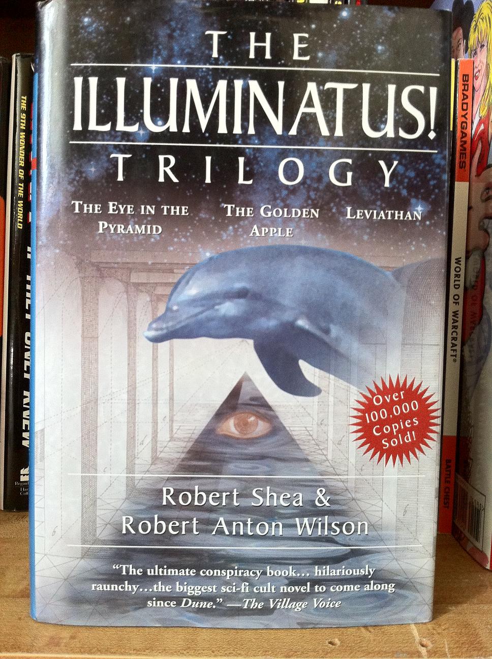
Andrew’s Art Direction: Okay, so here’s my idea. Fonts. This is a terribly confusing trilogy of books and we want the readers to know it. So I want no less than 2 font types and 4 font sizes. The artwork? Well it technically falls under sci-fi, so make sure there is a star-scape on there. People will like that. Then slap on just enough plot material to make the readers confused about what they are picking up. I smell an epic win with this one!
Published 1998


 Click for full image


Recent Comments