Jan 20
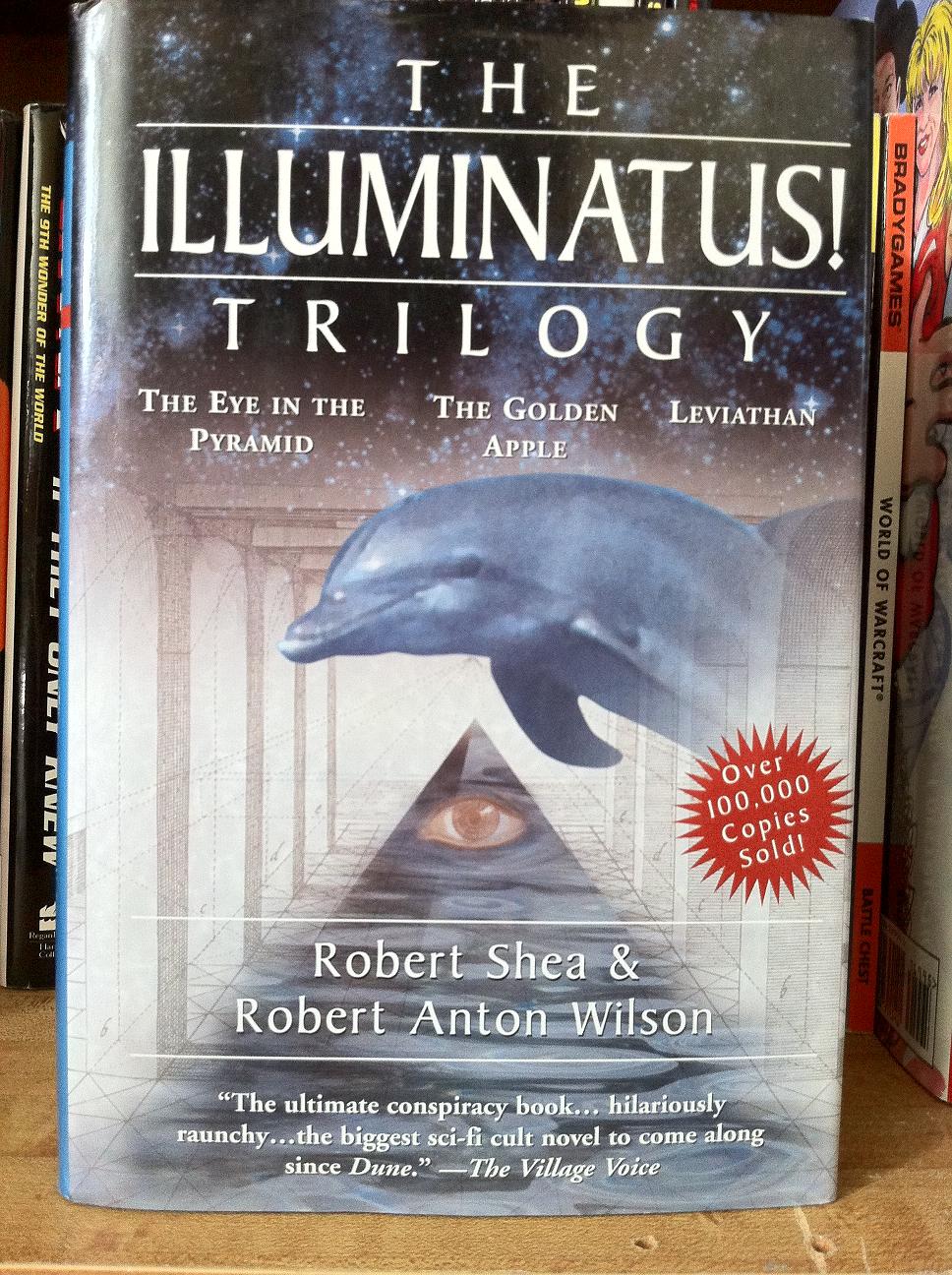
Andrew’s Art Direction: Okay, so here’s my idea. Fonts. This is a terribly confusing trilogy of books and we want the readers to know it. So I want no less than 2 font types and 4 font sizes. The artwork? Well it technically falls under sci-fi, so make sure there is a star-scape on there. People will like that. Then slap on just enough plot material to make the readers confused about what they are picking up. I smell an epic win with this one!
Published 1998


 Click for full image


January 20th, 2012 at 10:09 am
That dolphin’s going to do itself a mischief on that pyramid…
January 20th, 2012 at 10:15 am
They call him Flipper, Flipper, faster than lightning…
Interesting to see that this book sits on the shelves between THE 9TH WONDER OF THE WORLD and WORLD OF WARCRAFT.
Somehow, I doubt that The Village Voice meant that phrase as a positive comment.
January 20th, 2012 at 11:48 am
So awful the dolphin flung itself onto the pyramid to escape…
January 20th, 2012 at 1:24 pm
Having read the trilogy I must say the cover is too understated, not enough clashing colours, fonts, weird images and unrelatedness.
January 20th, 2012 at 3:02 pm
The Illuminatus!!!!!!! Trilogy
Ok, let’s check out this cover art.
• The Eye in the Pyramid *check*
• Leviathan – Well, I usually think bigger than a dolphin for leviathan, but I’ll let it slide. *check*
• The Golden Apple … What happened to the golden apple?
January 20th, 2012 at 4:17 pm
Leviathan a dolphin? Not quite William Blake, is it, Sirs Robert and Robert.
January 20th, 2012 at 4:31 pm
I have to say that this is one of the better covers for the Illuminatus trilogy that I have seen.
January 20th, 2012 at 4:41 pm
“Make the readers confused about what they are picking up” ?
From what I hear about the trilogy, they’ll still be confused about it long after they pick it up.
January 20th, 2012 at 5:11 pm
I dunno. Can the cover artwork ever be *too* weird for The Illuminatus! Trilogy?
January 20th, 2012 at 6:10 pm
Would the cover art on “The E.S.P Worm” be too weird for “The Illuminatus! Trilogy?”
January 20th, 2012 at 6:57 pm
Or, come to think of it, the centaur with little centaurs for hands. Or the Viking with a bottom for a face. Would any of them do?
January 20th, 2012 at 7:58 pm
Robert Anton Wilson “introduced the hell out of” The Illuminati of Immortality.
http://www.goodshowsir.co.uk/2011/03/the-illuminati-of-immortality/
I’ve since read that book, and it turns out the woman on the cover is Artemis. And, I have to say, the “metaphysical climax” did not “astound” me.
Also, judging by the “extensive introduction”, Wilson seemed to specialize in cryptic mumbo-jumbo. Sorry, Illuminati fans.
January 20th, 2012 at 10:41 pm
Ehm, I’m going to have to vote this one down. Not only would I be seen in public reading this book, THEY want me to. 🙂
January 21st, 2012 at 12:15 pm
My, but it does look cheap. Some stock shots of a starscape, a dolphin, an eye, a pyramid and an architectural drawing composited together makes a cover? Apparently as long as you can splash OVER 100,000 COPIES SOLD on top of it, anything goes.
January 21st, 2012 at 8:44 pm
I’ve read the book — good crazy fun.
Considering how much weird, hilarious and naughty stuff is actually IN the book, and which you could show on the cover without getting sued, I can only concclude that the editor chickened out and went for a “safe” non-threatening cover that doesn’t really say anything.
January 21st, 2012 at 9:31 pm
Titty Sprinkles 🙂
January 22nd, 2012 at 1:17 am
I’m with Pat at #4: from what I remember of this trilogy, this cover is far too subtle and coherent.
January 27th, 2012 at 7:21 pm
Over one hundred thousand copies sold? Worldwide?
Well, whoop-de-doo.
January 30th, 2012 at 11:51 am
I have to be fair here. As a cover, this works perfectly well, does the job, conveys enough of the book. Snarking about it as art — and even there it is competently-done art — is beside the point.
January 31st, 2012 at 2:28 pm
Well, to be honest, the original editor’s rant on this one was a bit longer. My main issue with this cover is it’s simply too busy. Not only too busy, but it merely gives a cursory nod to objects or events in the novel, and not ones that will facilitate drawing a potential reader into the purchase. The worst thing about the cover is the horrid amount of textual information they tried to get across. Editorial reviews work well for back covers and jacket flaps. Having them mucking up the front when you already have the main title, three sub-titles, and the names of two separate authors only leaves a third of the total space to display the artwork itself; and that third is further cluttered with the out of place red star burst toting a sales figure that even in the early nineties wasn’t all that impressive. I’ve heard that other covers for this trilogy were worse, and now I’m thinking of trying to track them down in order to see what others feel is worse. As nice as the artwork is, I just think that this one tried too hard and doesn’t succeed as a cover really should.