Adam S Comments: So this is what He-Man sees when he’s tripping on acid.
Published 1964
Adam S Comments: So this is what He-Man sees when he’s tripping on acid.
Published 1964
Scott B’s Art Direction: Take a woman with highly improbable hair, with a snake wrapped around her shoulders. Sexy, eh? But we need to make it all technological-like, so the snake’s actually made of fiber-optic wires or something. And throw a computer keyboard behind her, to make sure people get it. Technology! Also put a giant floating head in the background — you know I require that on all my covers!
Published 1991
Man of the Mountains Comments: So, we talk about mystery, mystery reader buy lots of paperbacks. How do we get the science fantasy people — what are the names of some of the popular magazines?
Published 1950
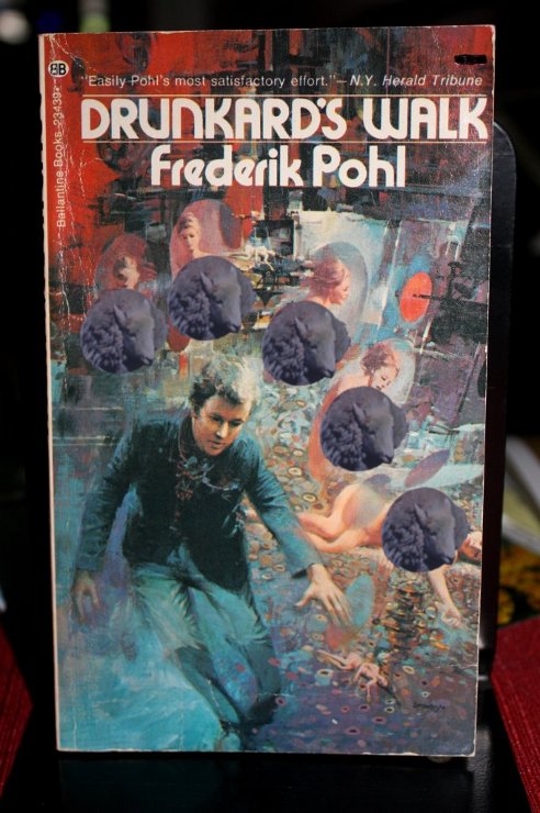
 Click for full SOUL CORRUPTING image
Ian’s Art Direction: Did you see the cover that came back from the artist? It’s full of crotches! Crotches! I’ll be damned if I’m going to pay that idiot to fix it. See if you can get an intern in here to cover them up with oblong stickers or smudges or something. Make it look natural.
Published 1973
Phil’s Art Direction: Are you SURE Bradbury is sufficiently recognisable enough to appear on his own book covers? Well, jazz it up a bit; he looks a bit plain.
Published 2009
SteveAsat Comments: You know what robots need? Buttcheeks. You know what they don’t need? Backpacks. I like to imagine that the dragon thing flits around by gently flapping his headwings and he just lets the big ones dangle as he glides majestically overhead.
Published 1981
Chris D Jr. Comments: If subtle clues such as the title of the book and the gun held by the bubble-helmeted, caped character on the front cover weren’t enough, the designer has managed to sneak in an oh-so-subtle name tag as a hint to the vigilant observer that the character on the front is probably ‘Gunner Cade’. Probably…
Published 1966
MisterBOB’s Art Direction: I think we all know what the author means by spells, wands in children’s hands. Paint the errors involved!
Published 1989
ScottB Comments: The two-faced three-eyed (on fire?) dog/man is a little intriguing/befuddling, as is the pointy-faced guy at top left. But I also appreciate the use of *asterisk* *emphasis* in Gibson’s blurb, as apparently the use of boldface would have been over budget.
Published 2010
Joachim Comments: Space Olympics look exactly like regular Olympics except in cartoon and a space ship poking up in the background…
Published 1967
Recent Comments