May 26
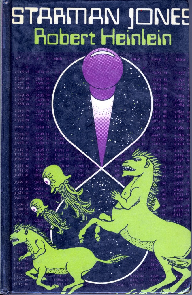
David Comments: I haven’t read this, so for all I know, centaurs and one-eyed jellyfish are essential to the plot. The S in JONES was cut off by the printer, not by me – it wraps round the edge of the cover (this is a hardback). The scan makes the colours look a bit more lurid than they really are. Published by Victor Gollancz, 1970
Another Heinlien! I’m flooded with them.
Thanks very much to David!


 Click for full image


May 26th, 2010 at 9:58 am
I read it and the cover makes no sense what so ever to me.
May 26th, 2010 at 10:12 am
We’ve had cataur’s this week. But what the heck are those? Some sort of reptile horse creature?
I do like this one. Space jellyfish! woo!
May 26th, 2010 at 10:12 am
It’s awful, yet I love it.
Aren’t those the aliens from The Simpsons?
High tech champagne cork is a nice touch. In space no-one can hear you pop your cork.
May 26th, 2010 at 11:26 am
I see booby!
May 26th, 2010 at 12:01 pm
Someone got their 11-year-old to do this as an art project. But what is the purple-headed knobby thing projecting out from the infinity loop? Surely it’s not meant to be some kind of spaceship.
It’s a Gollancz cover but, being as it’s from forty years ago, at least Simon can’t take the rap.
May 26th, 2010 at 3:04 pm
I have no idea what this is supposed to be but I kind of love it in an it’s so bad it’s good way. It looks like someone doodled it in a really dull science lesson.
May 26th, 2010 at 3:04 pm
Did they have POD in the seventies? Cause that is seriously what this looks like.
May 26th, 2010 at 3:34 pm
I like the five-oclock shadow on the centaurs’ bellies. ‘We’ve been chasing one-eyed jellyfish all day! We haven’t had time to shave our bellies!’
May 26th, 2010 at 7:25 pm
That font really fixes it to 1970 for me.
I hope this book originally had one of those bland yellow Gollancz dust jacket so that the discerning reader could keep this bizarre design under wraps.
May 26th, 2010 at 8:21 pm
What is it with sci fi and fantasy covers making covers that denigrate the centaur race? Ugh. Now I’m going to the mini-me on my left arm.
May 27th, 2010 at 9:58 am
WTF? Heinlein couldn’t have approved this.. Not only has it nothing to do with the book; I could draw something better than this dross.
May 27th, 2010 at 2:25 pm
It really does look like a 5 year old drew it.
However, the fact its such poor detail, means you could almost get away with it on a train. Its almost post modern. Years ahead of its time. I mean just compare it to any of heinleins covers, its practically a masterpiece of style and minimalism. Scary thing is, I could definately see that cover fitting in on a modern shop bookshelf.
May 27th, 2010 at 7:58 pm
The numbers fit part of the plot of the book. A shame they’re in the background and almost impossible to spot.
May 27th, 2010 at 8:09 pm
The “wraparound” could be because it is a library binding, rather than a true hardcover. In fact, because it is shiny and doesn’t have a dust jacket, I’m going to put my money on library binding.
What happens is the binders strip the cover off the paperback, and bind it to a special durable cardboard with a reinforced spine to stand up to library use.
Sometimes, they don’t use quite the right size to fit the cover (I imagine this is b/c they only have a limited number of standard sizes) so they just wrap it around.
But that’s the ONLY defense I’m going to make for this cover.
May 30th, 2010 at 8:55 pm
Well spotted! This is an ex-library book. The page for stamping the return dates can be seen here, if you care.
March 5th, 2020 at 9:15 pm
A definite “it’s skiffy so it must be for children” vibe about this cover…
March 6th, 2020 at 5:17 am
@ARY: It is one of Heinlein’s juvenile novels. And there are centaur-ish aliens.
March 7th, 2020 at 3:30 am
That’s one hell of a purple pushpin….
March 7th, 2020 at 8:23 pm
@Hammy: No kidding. It seems to be holding infinity! Sideways. Either that or it’s a #8 size pushpin
March 8th, 2020 at 3:33 am
@GSSxn: And here I was thinking it was the pivot point for the largest propeller in space. I was going to add “least-effective propeller in space”, but I guess that goes without saying…..