Mar 21
 Click for full image
Good Show Sir’s Art Direction: I need to get into their mindset. What does the public want to see on their book cover… public…. cover…. public… pubic…. GOT IT! Giant floating glowing crab! Maybe a dragon too, but that’s just a background thought!
Published 1990

Loading...
Tagged with: Corgi Books • crab • damsel • dragon • dude • font problems • giant enemy crab • glow • Hugh Cook • magic • once you see it • robes • ships • Steve Crisp • strange creature • three wise men
Mar 07
 Click for full image
Good Show Sir’s Art Direction: Stuck for something to draw eh? All one has to do is follow the editors rhyme, “Golden chair on which a hunk may sit, dinosaur.” Yeah… it’s not much of a rhyme really. But here’s the twist: it’s in space!
Published 1989

Loading...
Tagged with: computers • dinosaur • dude • Jack L. Chalker • lizards • Penguin Science Fiction • Peter Goodfellow • space • space ships • throne
Jan 08
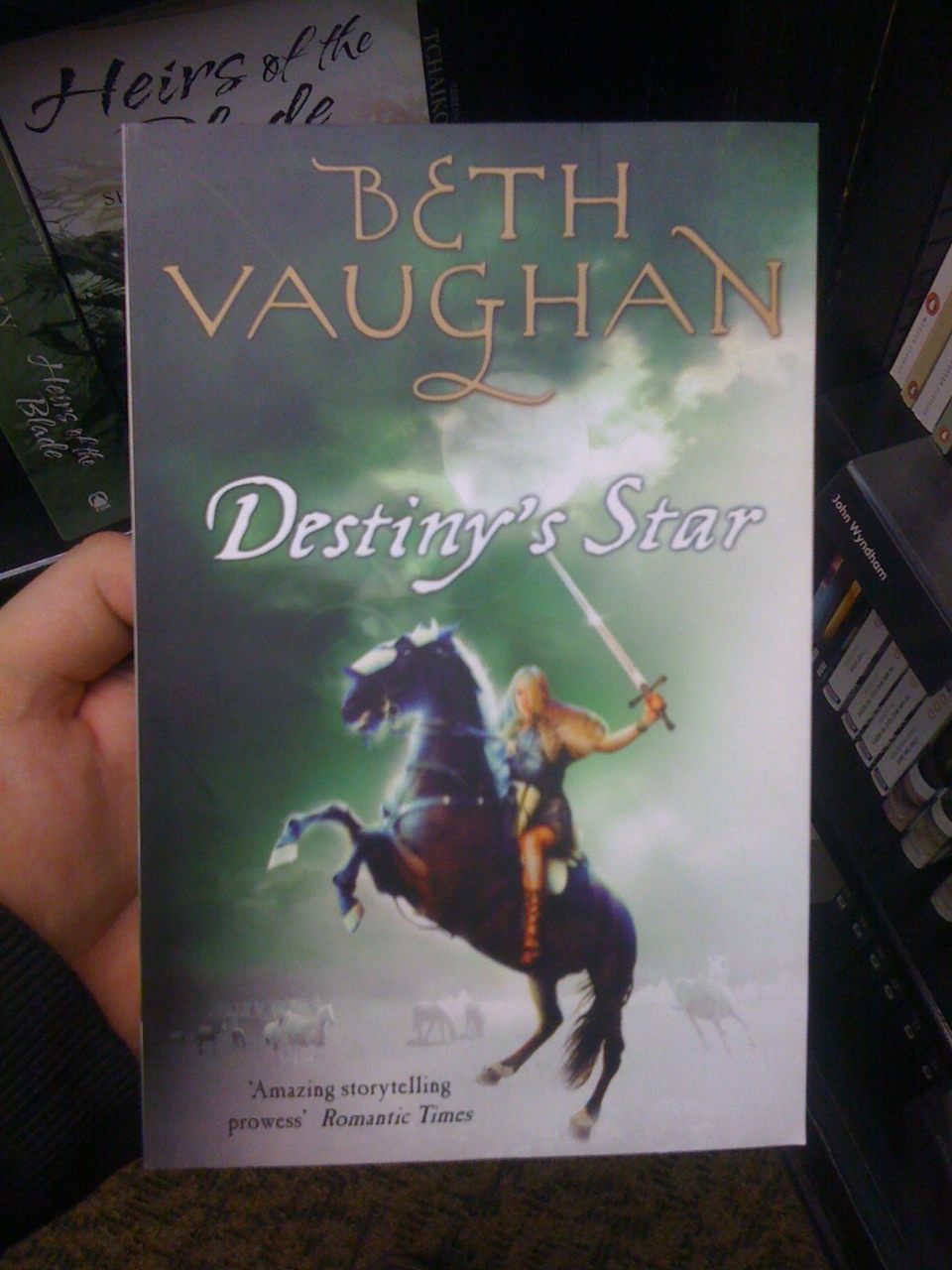 Click for full image
Good Show Sir’s Art Direction: No no no… I said more glow! And more Ting! And more of the horse looking like he’s awkwardly floating over a field!
Published 2011

Loading...
Tagged with: bladed weapons • damsel • floating horse • glow • Gollancz Books • horses • sword • Ting! • Unknown Artist Institute • war
Dec 17
 Click for full image
Frank Comments: Good thing that fern was handy, else the publisher would have had to get really blatant with that maple leaf. All the electronic equipment out among the foliage is worrisome too. I’ve seen what happens when that sort of thing is left in a damp environment and it’s not good for continued operation.
Published 1972

Loading...
Tagged with: cleavage • computers • damsel • devil's dumplings • dude • Gene Szafran • Pocket Books • strange creature • William Hjortsberg • WTF
Dec 05
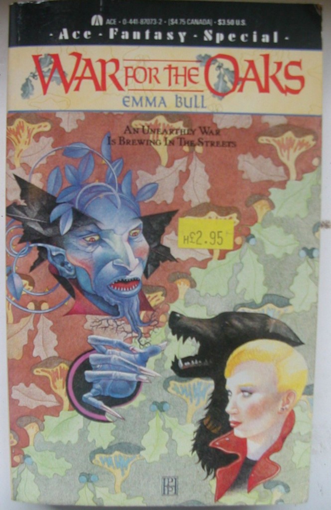 Click for full image
MisterBob Comments: What if William Morris painted Fantasy covers?
Published 1987

Loading...
Tagged with: Ace Books • damsel • Emma Bull • monster • Pamela Patrick • strange creature • WTF
Nov 29
 Click for full UNSHEEPED & UNLEWISED image
Ian Comments: No one will notice the nude lady disguised as hills and valleys. Bound to get more sales that way.
Published 1976

Loading...
Tagged with: Carlos Ochagavia • cleavage • damsel • David Bergamini • devil's dumplings • planets • Popular Library • WTF
Nov 26
 Click for full image
Tat Wood Comments: This is by way of adding to the conversation about recycling artwork. Ideally, it should be appended to the comments on ‘The Rod of Light’. No prizes for guessing what it originally covered, but given that Dick’s book has some pretty distinctive visual iconography (mentioned in the title) it’s a stupidly inappropriate choice.
Published 1975

Loading...
Tagged with: Bruce Pennington • desert • dude • Manor Books • ninjas • once you see it • Philip K. Dick • space ships
Sep 25
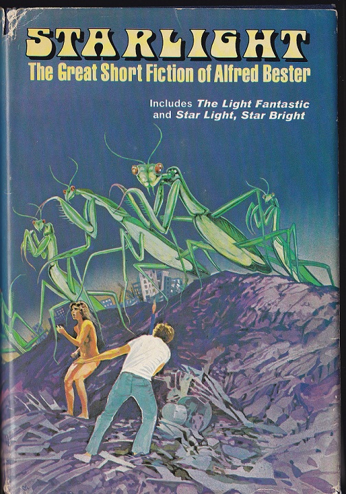 Click for full image
Vincent’s Art Direction: So here’s what I’m thinking. A man and a woman in a landfill. I want the woman tastefully nude, so have the man covering her naughty bits even though they’re standing about twenty feet apart. Lastly, have an army of giant preying mantises coming over the hill.
Published 1976

Loading...
Tagged with: Alfred Bester • cleavage • damsel • dude • giant insects • Jack Woolhiser • jeans and a t-shirt • monsters • Nelson Doubleday SFBC • starkers • strange creature
Sep 12
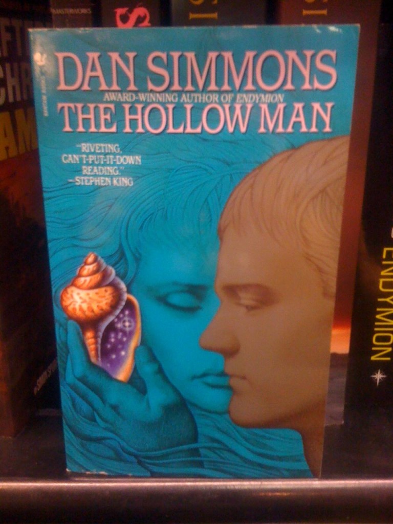 Click for full image
Good Show Sir’s Art Direction: Look this has to stand out from the rest. But how…. ummm… put a magic sea shell with stars of the universe in it. Have a disinterested man staring at it… and a blue women who is already so bored she’s fallen asleep.
Published 1993

Loading...
Tagged with: Bantam Books • damsel • Dan Simmons • dude • font problems • John Jude Palencar • magic • statuesque
Aug 07
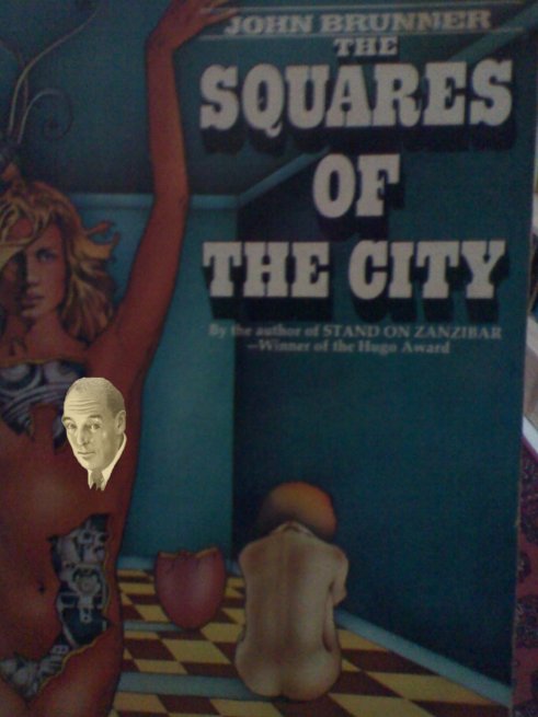 Click for full UN-CS-LEWIS’ED image
Piper’s Art Direction: What do you mean a naked Terminator woman won’t do? Fine, add another woman in the background curled up in a ball and she HAS to be naked too. That, a broken egg and some kitchen tiles and I think we’re done here.
Published 1973

Loading...
Tagged with: Ballantine Books • C.S. Lewis • Charles Moll • cleavage • damsel • devil's dumplings • geometric oddities • John Brunner • space sheep • WTF


 Click for full image


 Click for full image
 Click for full image
 Click for full image
 Click for full image
 Click for full UNSHEEPED & UNLEWISED image
 Click for full image
 Click for full image
 Click for full image
 Click for full UN-CS-LEWIS’ED image
Recent Comments