preload
Apr 26

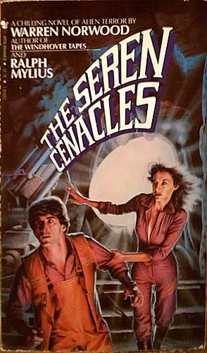
No come back! Our hair looks amazing in front of this white hole of nothing!

Alessandra Comments: This is one of those subtly wrong covers. What’s up with the faces? And looking closer, the anatomy. His eyes are oddly round and oddly placed, a little too close together and a little too skewed to our right. Her right eye (on our left) is too low, giving her an odd one-eyed (or in the right light, three-eyed) look. Not a cover that screams its wrongness, but still eye-watering when you look closely.
Published 1983

Actually, that cover IS a classical work of art!I would touch it without protective gloves.I've seen worse. Far, far, worse.Interesting, but I would still read it in public.Middlng: Neither awful nor awfully goodWould not like to be seen reading that!Awful... just awful...That belongs in a gold-lame picture frame!Gah... my eyes are burning! Feels so good!Good Show Sir! (Average: 5.73 out of 10)
Loading...

Tagged with: