May 11
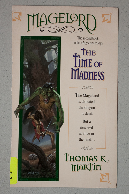
Eron comments: This cover isn’t really funny. The art isn’t even particularly bad. But a warning to anyone who has ever even had the passing notion to take a graphic design class: do not look at this cover, you will get a rage-migrane for days. The layout is so shockingly poor and amateur that the thought that someone got paid for this, not beaten in a alley, just plain makes me want to drink whiskey and punch random objects!
My eyes…my eyes! Thanks to Eron!


 Click for full image


May 11th, 2010 at 10:31 am
Not that bad really. Did Eron rip the cover off the book in a rage though? 🙂
And to be very fair. I’m not sure one could do the ole matrix twist with such armour!
May 11th, 2010 at 11:53 am
Care to explain why this layout is so bad? I’m so un-arty I practically have wooden eyes, but I’m interested in design nonetheless. (Count me under “anyone who has ever even had the passing notion to take a graphic design class”!)
May 11th, 2010 at 12:31 pm
As a graphic designer, I have to thank for the rage-migraine.
At least there’s only two fonts used.
May 11th, 2010 at 1:34 pm
It looks more like an advert than a cover, I think that’s the problem.
Green troll-y monster guy has great hair, through.
May 11th, 2010 at 1:44 pm
Somewhere in there is a joke about PMS.
May 11th, 2010 at 1:46 pm
Is that the skeleton of poor old Zebedee from the Magic Roundabout, lying on the ground?
May 11th, 2010 at 2:30 pm
I agree the illustration is not bad. I assume the knight guy is SUPPOSED to look like he’s about to fall on his ass and is flailing his shield wildly to try to keep his balance? There is something very menacing about the monster advancing while the fighter is so badly off balance.
May 11th, 2010 at 5:30 pm
lol Adam, wow nicely spotted, that rib cage is epic.
I agree with james that its main problem is that it looks like a full page colour ad in the big issue, even the font seems slightly squashed to fit. I imagine its better written that the big issue though.
If you arent gonna have a huge cheesy picture on a cover you’ve gotta make the cover plain but stylish instead, This cover has no style and only half a cheesy picture, so its just meh. i mean for gods sake man, its beige!
May 11th, 2010 at 5:42 pm
That cover blurb in full: ‘The MageLord is defeated, the dragon is dead. You now have no reason to read volume 1 of this series.“
May 11th, 2010 at 10:51 pm
I think I laid something better than that out when I was 14 and learning to use DTP software in school.
May 12th, 2010 at 3:04 am
No single thing is bad, but throw all together it looks like a giant unfocused catastrophe.
May 12th, 2010 at 4:47 pm
Maybe this was actually the publisher’s version of Pin the Tail on the Donkey at their christmas party. Instead of a tail, they had to blindfoldedly (that should totally be a word) glue the cover elements to the cover. After two or three shots, of course. Then they printed it.
@DeadRobot: I hate to be the one to say this, but there IS actually three fonts on the cover. One for the title, one for the subtitle & author (although they used different colors to cover up that it’s the same font. Yay?) and the blurb font.
November 20th, 2013 at 7:20 pm
Thank God! I am so sick of publishers wasting the entire cover on full-color illustrations! Here we have a cover that gives the people what they really want:
FONTS.
November 22nd, 2013 at 11:22 am
“A new evil is alive in the land… Thomas K Martin.â€
Guess he’s the green orc/troll.
November 22nd, 2013 at 2:19 pm
Stop vamping, Sir Knight! Yes, you have the coolest, shiniest and certainly the most flexible armor we’ve ever seen, but if you don’t stop admiring how hip you look while you limbo, you’re gonna miss the kill shot this idiot orc/troll has just given you. Just stab, already!
June 16th, 2021 at 1:23 pm
It’s not so much a “book cover” as a promotional poster that was sent to the wrong address.