May 07
 Click for full image
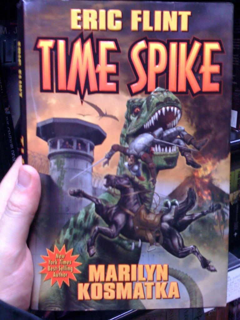
OK, I’m spinning my cover creator wheel and its landed on, volcano… good. Spin again… horse-riding knight. OK, I’m throwing the action dice and it’s landed on… being eaten, nice. Another spin… T-REX, sounds awesome! In the background we will have a… prison wall and… a guard post.

Loading...
Tagged with: anatomical issues • artist in the comments • Baen Books • bladed weapons • David Mattingly • dinosaur • Eric Flint • fortress • horses • knights • lava • Marilyn Kosmatka • once you see it • shuriken of approval • surprised dinosaur • surprised horse • sword • time travel • volcano
Leave a Reply


 Click for full image

 (Average: 8.54 out of 10)
May 7th, 2009 at 9:49 am
I don’t understand…. who wrote this book… Eric or Marilyn? Both?
May 7th, 2009 at 9:59 am
Maybe their secret love-child wrote it?
This is an almost perfect cover in my opinion. Theres so much going on, and almost nothing on the cover should have any relation to anything else on the cover, brilliant. Also, the offensive embossed font is a typical bonus to any Flint masterpiece.
I can actually picture Flint sitting down with his editor with some dice and the wheel to come up with that cover/story.
Also i just want to say… that is, without doubt, the BEST drawing of a horse i’ve ever seen… flawless, its ass and legs look so real
May 7th, 2009 at 10:20 am
Near-perfect Bad Cover Roulette in evidence here. Good show, sir, good show.
May 7th, 2009 at 11:58 am
Wow now that horse is amazing!
Was the guy leaping at the t-Rex when he got chewed?
May 8th, 2009 at 11:13 am
Given the book’s title, it’s entirely possible that the horseman was peacfully cantering along of a summer’s evening, leapt over a hedge or perhaps a low fence, straight into a manifesting *TIME SPIKE*, and out into the coincidentally gaping jaws of a T-Rex on the other side.
Too far fetched? Check out the Rex’s eyes for more than a hint of “what in the blazes..”.
I’m liking the similarity between the “S” of Spike and the Jurassic Park font. Can’t quite place the M or E though.
April 30th, 2010 at 8:25 pm
If anything, the actual story is trippier than the cover. A time displacement rams through many eras, dumping a collection of different groups from North America into dinosaur time: a prison in Illinois, a group of Spanish explorers, part of the Trail of Tears tribes and a pre-Columbian town. And while I don’t think the T.rex actually chomps any Spaniards, they’re around. And there’s volcanos.
May 12th, 2010 at 2:11 pm
Hey guys! Do you ever read the books before you comment on them? In the case of Time Spike, this scene actually occurs. The bad Conquistador gets eaten by a T Rex in the end. I admit that the prison isn’t in the background when it happens, but it gives the story context. There is an erupting volcano since the prison had been transported back to the dinosaur era. I thought this was a pretty terrific book, and the cover an accurate representation of the story.
David Mattingly
May 12th, 2010 at 2:59 pm
Hey David. Unfortunately we can’t read them all, I would love to be able to. Though between the few of us that ‘run’ things here we certainly have bought our fare share of books simply based on the covers and so far I have given each one a read.
Time Spike is one of our personal favourites here! Where else could one find a t-rex chowing down on a conquistador? We all love these covers and their unique awesomeness.
Hope you are enjoying the site.
March 23rd, 2013 at 8:51 pm
Goodness! Look at the arse on that horse! That horse is friggin’ RIPPED! Rex is probably thinking, ‘I’d better get his secret before I eat him.’
Also, kudos to the font designer for putting the spike on the middle stem of ‘time’. Awkward to read but TREMENDOUS visual pun.
March 24th, 2013 at 1:38 pm
Shruiken of approval? It’s spelled shuriken, dammit.
March 25th, 2013 at 7:48 pm
Thank you Tag Wizard for fixing that.
March 25th, 2013 at 9:11 pm
Thank you Tag Cowie for drawing attention to the wayward tag.
April 17th, 2013 at 8:22 pm
I don’t know who keeps down-voting all the Baen Book covers, but you are a terrible person.
April 17th, 2013 at 8:32 pm
Hypothesis: the splash “New York Times Best-Selling Author” which appears on 2 out of 3 Baen covers does NOT refer to the bestseller list, but to how many newspapers the author sold door-to-door as a kid.
October 9th, 2015 at 3:31 pm
How has Michael Bay not made this into a MAJOR MOTION PICTURE yet??
May 27th, 2016 at 8:35 am
“Dammit! Someone left the gate open between Jurassic World & Medieval World again!”
May 27th, 2016 at 10:56 am
Don’t roar with your mouth full.
May 27th, 2016 at 12:07 pm
Wot no baen cover logo ?
How are readers supposed to make up their mind without it ?
May 27th, 2016 at 2:59 pm
Buffy fans will enjoy.
May 27th, 2016 at 3:43 pm
BEHIND YOU!
In Front Of You!
Next To You!
All Around You!
May 27th, 2016 at 6:16 pm
The embarrassing ABC version of ‘Supergirl’ made James Olson both African American and Kara’s boyf, so changing the colour of Comet the Superhorse is the obvious next step.
January 22nd, 2017 at 6:16 am
I don’t like the strap around horsie’s neck; looks like it might strangle him (which could explain the ass and legs). I was going to comment about the saddle being incorrect for medieval, but since the artist has said it was in fact a conquistador, I withdraw the objection.
T. rex seems to have a spike on the end of his nose sticking up into the word “SPIKE”, which is also kinda clever.
But again, no BAEN! book would have a title on the cover if making fonts orange was disallowed.
@Tom Noir: How is it that Michael Bay hasn’t bought Baen Books (making it Baen Bay Books?) outright and just made the whole damn line into movies?