Tom Noir Comments: No seriously man, I just want to take a little bit off the top!
Published 1990
Tom Noir Comments: No seriously man, I just want to take a little bit off the top!
Published 1990
Christian Comments: This is truly the fantasy of every elementary school boy. Knight in shining armour with laser gun and sword while riding a dinosaur with a mohawk and ankle spikes. Epic.
Published 2002
Dead Stuff with Big Teeth’s Art Direction: Gentlemen…perhaps what this cover needs is both a man, and a horse! Yes! And another man with a mullet, showing he doesn’t know how to ride a horse. And… a girl wearing nothing but body paint, standing at the top of a staircase! Because, gentlemen: nobody would otherwise pay money for something a woman has written!
(the senior partners, followed by everyone else in the room, erupt in a perfect storm of applause. The junior copyrighter wipes a tear from his eye)
Published 2003
Tom Hering Comments: From St. John to Krenkel to Frazetta to this. The most egregious example I’ve ever seen of a publisher using an amateur artist to save a little money.
Published 1977
Frank Comments: Cover art by Gino D’Achille. Who I note wasn’t afraid to paint a lady warrior with a bit of convexity where her tummy should be. I approve!
Published 1978
MisterBOB’s Art Direction: One hot chick with boobs on show and her two angry brothers.
Published 1987
 Click for slightly larger image
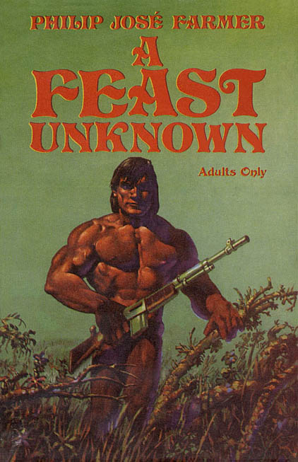
Joachim’s Art Direction: A man with no hips holding his gun, and a thorny branch…
Published 1975
Good Show Sir’s Art Direction: Well it’s the 1980’s, so whats popular at the moment? Oh I know, why not put Rutger Hauer jumping on the back of an over-sized gremlin!! I mean that’s in the book… right? What!?! You didn’t read it either! It’s his 23rd book in the saga, I just assumed he’d be pretty good at it by now!
Published 1985
 Click for slightly larger image
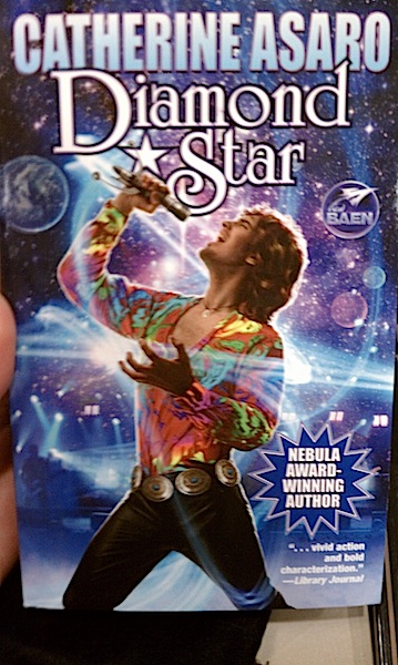
Alessandra Comments: Ow, ow, ow! I’m doing a dental self-exam, my back is thrown out, and I’m carrying this armful of light-sabre blades!
Published 2010
 Click for slightly bigger picture
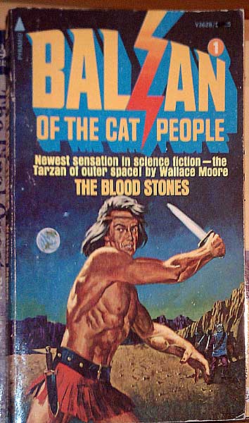
Alessandra Comments: The cover isn’t really awful, although it is pretty behind the curve for 1975. What got me was the hideous font lightning effect, the confusing typography (the title is actually “The Blood Stones”), and the extreme genericness of the cover — oh, and the Conan-gets-a-mullet hairdo.
Published 1975
Recent Comments