

Apr 13
 Click for full image
Jeremy’s Art Direction: We need the most evil guy ever. Ever! And the goofiest looking assassin you can muster!
Published 1982

 (Average: 6.95 out of 10)
Jeremy’s Art Direction: We need the most evil guy ever. Ever! And the goofiest looking assassin you can muster!
Published 1982
(Average: 6.95 out of 10)
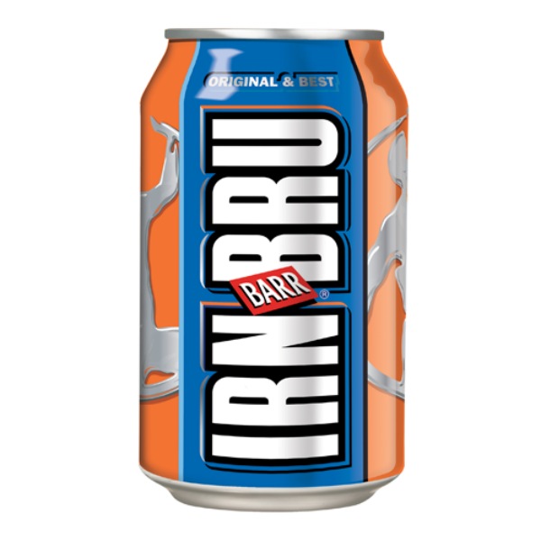
Here we are again! It’s been a while for the old honourable mentions but it’s come to that time of year when a can of irn-bru and chocolate is considered an acceptable breakfast!
So if you are having a weekend off I hope you enjoy it and if not… well enjoy these covers that don’t quite make our high standards but we think deserve a special mention.
Have fun!
Good Show Sir Comments: I love Mark Hamill’s pose on this one. It’s got that, “Why are you drawing me?” Look.
Good Show Sir’s Art Direction: Well I like these three drawings you’ve done. I know! Lets just put them all together on the cover.
Matthew’s Art Direction: I want the scariest-looking monster that you can think of on the front!
Stripey Baz Comments: I’m no purveyor of romance novels or indeed Norwegian literature, but I’m pretty sure that it’s not a good thing to have a mutton-chopped blaggard slap a fair maiden across her face. Given the angle that he’s standing at, his body must have twisted like one of those plastic toy action figures…
 (Average: 7.72 out of 10)
Patrick Comments: They might well look worried.
Published 1993
(Average: 7.58 out of 10)
Art Direction: Look it’s Friday, so stop asking me hard questions! Just put a naked human sized fairy on a beach somewhere. And two glowy boxes in the corners. Why? We’ll reach two kinds of people: those who love the sea and those who love naked fairy bums. And anyone who likes both, then WHAM! Instant cash!
Published 1987
(Average: 5.68 out of 10)
Rusty Comments: How one can tell a true hero from a common man is by whether his shirt disintegrates in an alluring yet ferocious manner at the drop of the hat.
Published 2011
(Average: 8.14 out of 10)
 Click for slightly bigger picture
Alessandra Comments: The cover isn’t really awful, although it is pretty behind the curve for 1975. What got me was the hideous font lightning effect, the confusing typography (the title is actually “The Blood Stones”), and the extreme genericness of the cover — oh, and the Conan-gets-a-mullet hairdo.
Published 1975
(Average: 6.92 out of 10)
Jason Comments: Thank God I started buying invisible eggs, that blonde would’ve ruined my red-heads omelette!
Published 1967
(Average: 7.76 out of 10)
Phil’s Art Direction: Look, no one will guess that this book is about futuristic police, unless you paint POLICE onto the side of that hovership. While you’re at it, give that policeman an unusually large face. I hear that’s how policemen will look centuries hence.
Published 1976
(Average: 5.79 out of 10)
Libraryman Comments: I just don’t understand what good those wings will be.
Published 1984
(Average: 5.54 out of 10)
MisterBOB Comments: In Space Jam Jars are Rather Useful…
Published 1980
(Average: 5.53 out of 10)
(9.27 out of 10) (9.22 out of 10) (9.04 out of 10) (9.03 out of 10) (9.03 out of 10) (8.99 out of 10) (8.99 out of 10) (8.98 out of 10) (8.96 out of 10) (8.96 out of 10) Click for full image
 Click for full image
 Click for full image
 Click for full image
 Click for full image
 Click for full image
 Click for full image
 Click for full image
 Click for full image
 Click for full image
 Click for full image

Recent Comments