Feb 01
 Click for full UNSHEEPED image
Marcus’ Art Direction: Fredric Brown mostly wrote short stories with twist endings. So let’s have a twist ending to the cover! But, at the same time, semi-naked women sell books. So we should have one of them. Not too big, though, we want lots of nice black space around.
Published 1980

Loading...
Tagged with: Bantam Books • cleavage • damsel • devil's dumplings • Fredric Brown • planets • space • space sheep • Unknown Artist Institute • WTF
Jan 31
 Click for full image
Andrew Comments: Teddy bears in Napoleonic garb, riding on dragon-horses in space. Baen, naturally.
Published 2000
It has come to our attention that this book is comedy, which bends our rules.
We appologise, but the cover is still amazing!
– Good Show Sir
Loading...
Tagged with: Baen Books • dude • Gordon R. Dickson • horses • Michael Whelan • once you see it • Poul Anderson • space • surprised horse • WTF
Jan 30
 Click for full image
Tom Noir’s Art Direction: Now look Horne, you’re a good artist, but you’ve got a thing or two to learn. See, this cover of yours, it’s just not realistic. Does this guy look like he just walked out of an explosion? No. He still has body hair. The fire would have burned it all off! Take this back and I don’t want to see it again until it looks like he’s fresh from a wax job.
Published 1994
Loading...
Tagged with: Avonova Books • casually walking away from an explosion • damsel • Daniel Horne • dude • font problems • muscles • scrolls • shiny • Song of Albion series • Stephen R. Lawhead
Jan 27
 Click for full image
Rachel J’s Art Direction: All right, this cover practically designs itself. Think “teleportation”, “futuristic detectives” and “shapeshifting alien saboteurs hiding out on the Moon”. I’ll leave the details up to you…
Published 1966
Loading...
Tagged with: Dennis Jackson • Lloyd Biggle Jr • Penguin Science Fiction • WTF
Jan 26
 Click for full image
MisterBob Comments: When i said a blindfold monkey could do the art, I didn’t mean…
Published 1970
Loading...
Tagged with: Dobson Books • Phillip E. High • Richard Weaver • strange creature • WTF
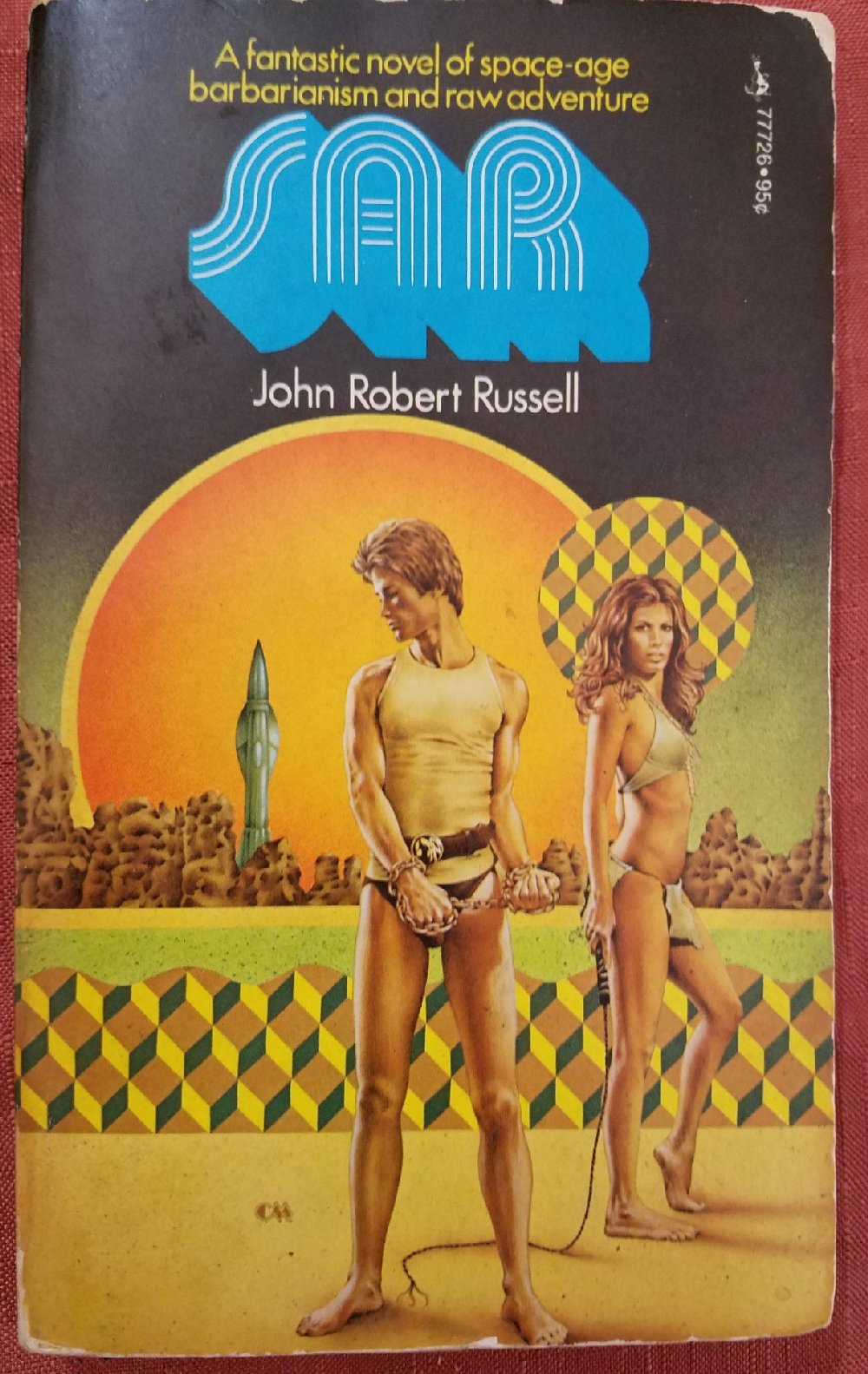
Jan 25
 Click for full image
Updated IMAX version of cover
Joachim’s Art Direction: “Raw adventure” — with a whip, in underwear, make sure there’s a rocket… you know what I mean… it’s science fiction.
Published 1974
Loading...
Tagged with: chains • Charles Moll • damsel • dude • font problems • geometric oddities • John Robert Russell • loincloth • Pocket Books • space ship • thong • underwear model • whip it good • WTF
Jan 23
 Click for full image
Art Direction: We all know the one thing vampires suffer from. Bighanditis! What do you mean that isn’t a thing? Of course it’s a thing, a vampire thing! Look it says right here in the book of ‘Your Pay Check’! Now, just draw some kid, in a cloak, looking like he should be in a broadway musical. And make his hands BIG!
Published 1985
Loading...
Tagged with: bighanditis • cloaks • Futura Publications • glow • moon • S. P. Somtow • Unknown Artist Institute • vampires
Jan 20
 Click for full image
Andrew’s Art Direction: Okay, so here’s my idea. Fonts. This is a terribly confusing trilogy of books and we want the readers to know it. So I want no less than 2 font types and 4 font sizes. The artwork? Well it technically falls under sci-fi, so make sure there is a star-scape on there. People will like that. Then slap on just enough plot material to make the readers confused about what they are picking up. I smell an epic win with this one!
Published 1998
Loading...
Tagged with: dolphin • eye-yi-yi • masonic symbols • MJF Books • Robert Anton Wilson • Robert Shea • shuriken of approval • strange creature • Unknown Artist Institute • WTF
Jan 18
 Click for full image
Scott’s Art Direction: I was drinking fairly heavily when I read, “The E.S.P. Worm” but I’m pretty sure it was about an estranged pair of anthropomorphic sticks of chalk, plus a bespectacled penis, I mean “worm”, lassoing the Earth with its magic rainbow powers. So put that on the cover!
Published 1970
Loading...
Tagged with: columns with faces • Paperback Library • Piers Anthony • planets • rainbow • Robert E. Margroff • Unknown Artist Institute • WTF


 Click for full UNSHEEPED image


 Click for full NON-HUMMINGBIRD WHALED image

Recent Comments