

Apr 15
 Click for full image
Mark E’s Art Direction: You remember “clip art” don’t you? Good. Use that. Use A LOT of that.
Published 1975


 (Average: 6.40 out of 10)
Mark E’s Art Direction: You remember “clip art” don’t you? Good. Use that. Use A LOT of that.
Published 1975
(Average: 6.40 out of 10)
Tom Noir Comments: “Gee willikers, Joe, I see skeletons!”
“F#*% this noise, Tom!”
Published 1959
(Average: 6.60 out of 10)
Perry Comments: I actually rather like the artwork for this junior, abridged edition (even the title’s abridged!), but remain intrigued by the gentleman depicted at centre. Either he was already blind, or, assuming he’s one of the multitude blinded the night before, clearly thought it important to locate/don dark glasses prior to venturing outside!
Published 1973
(Average: 5.25 out of 10)
Good Show Sir’s Art Direction: Look it’s based off a role-playing game so we’re technically a franchise… which means we don’t need to care about appearing on the website Good Show Sir… whatever that might be in the future. I want to see plenty of clenched jaws, and unnatural glows… like they’ve been sitting on a reactor!
Published 1999
(Average: 6.70 out of 10)
Well today is a bank holiday and I completely forgot about it. Almost got up to go to work! Almost…
So for all your enjoyment here is a few covers that I believe make the Honourable Mentions standard! Have a good holiday for those who remembered!
DarkZlorf Comments: I’m sure I left my tank parked around here?
Published 1979
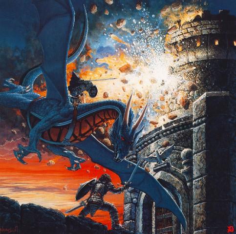
Completely stolen from the wonderful Awful Library Books, but because the top left is clearly a copy of Keith Parkinson’s Dragons of War, I thought it too good not to mention! Thanks to John for letting me know about it!
So I found this is in a touristy shop in the wonderful San Diego… paper dolls… what’s with that? Anyway, I had hours of fun recreating all my covers that day!
Published 2010
(Average: 7.65 out of 10)
I have been enjoying the delights of Helsinki this week and I have had a wonderful time. Well, except for the price of beer! 7 Euros for a pint! It makes me want to cry!
In honour I decided to search through a couple of the book shops here for the Finnish versions of some popular Sci-Fi and Fantasy. Some of them are just a little odd and a couple do make me laugh.
I hope you all enjoy these wonderful covers!
(Average: 6.60 out of 10)

Good Show Sir comments: “Argggh! I put me armour on backwards!”
Published 1977
(Average: 6.16 out of 10)

Ryan comments: The cover of “Fool’s Run” was so shiny that I took it into the bathroom and tried to photograph it in the dark. No luck, it was either almost unviewable because it was too shiny, or else it was eclipsed by the darkness; there was no middle ground.
You might remember this from here.
Published 1988
(Average: 5.00 out of 10)
Tor Mented Comments: I think the artist misunderstood the concept of panty shields.
Published 1973
(Average: 3.89 out of 10)
Good Show Sir Comments: According to the punctuation, Frank O’Rourke IS Instant Gold!
Thanks to Ryan for sending this in!
Published 1966
(Average: 7.95 out of 10)
(9.25 out of 10) (9.18 out of 10) (9.02 out of 10) (8.97 out of 10) (8.93 out of 10) (8.93 out of 10) (8.93 out of 10) (8.92 out of 10) (8.89 out of 10) (8.88 out of 10) Click for full image
 Click for full image
 Click for full image
 Click for full image
 Click for full image
 Click for full image
 Click for full image
 Click for full image
 Click for full image
 Click for full image
 Click for full image
 Click for larger image
 Click for larger image
 Lastest Tweet
Recent Post Comments